Pavi Direct SA is a company based in Ticino that specializes in the direct sale of parquet flooring, adhesives, accessories, baseboards, and skirting boards, as well as equipment rental.
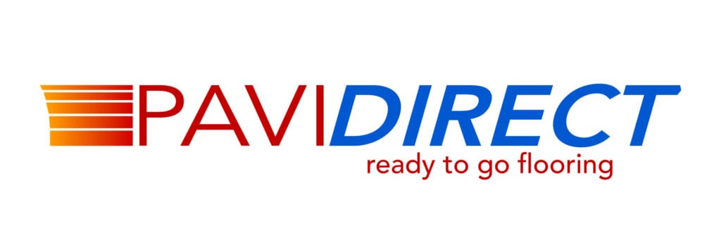
PHILOSOPHY OF THE PAVI DIRECT SA LOGO
Pavi Direct imports and sells hardwood flooring and other types of flooring directly to end customers; therefore, the entire logo conveys speed, with the final “T” featuring an integrated arrow. The colors red and blue represent the company’s roots in Ticino. The red and gold lines represent the various types of flooring in all sizes and styles. The gold symbolizes the quality of the products offered by Pavi Direct SA.
At the same time, the slogan “ready to go flooring” encapsulates everything the company does and how it does it in a modern way, as Pavi Direct SA is focused on the future and success.
HOW WE WORK
When we design a logo, we listen.
After listening, we ask about the company’s history, mission, products, services, and so on. Then we come up with a brilliant idea to represent all of that and capture it in a logo that fully embodies the company.
A logo is not just an advertising graphic; for us, a logo embodies a company’s philosophy, encapsulating its culture and values.
Coming soon: the new Pavi Direct SA website, also created by ticinoWEB.