web designer locarno, lugano, bellinzona

Each company logo embodies a philosophy of life.

Giovanni Frino

design logo aziendale
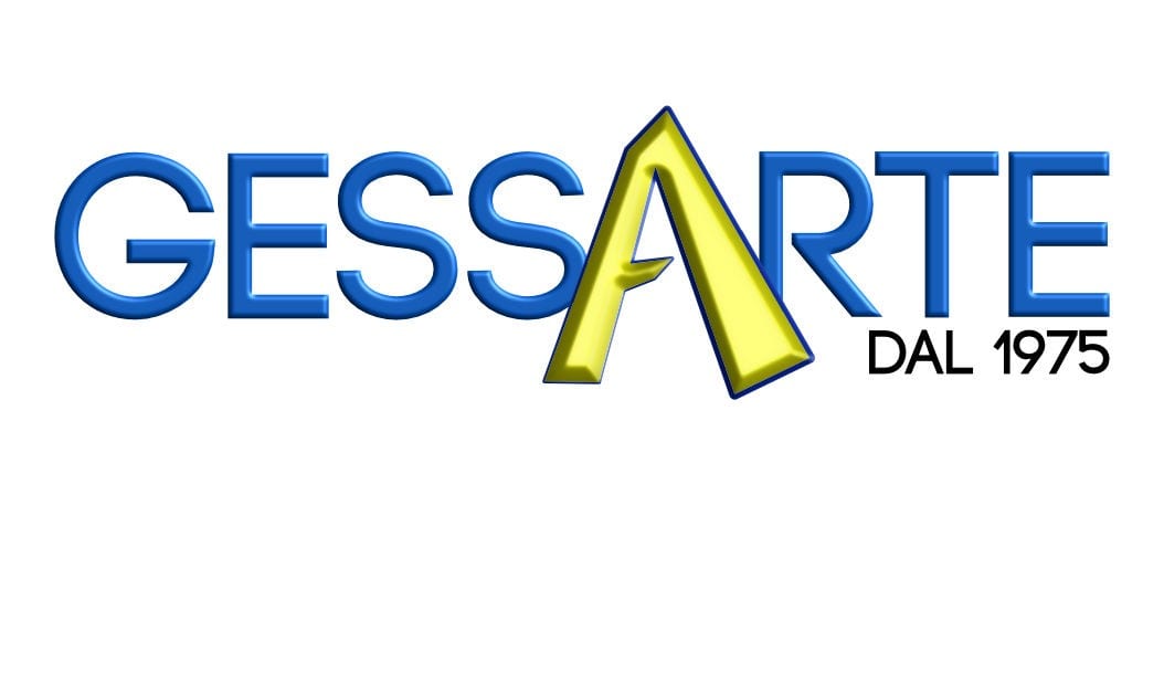
A slight 3D effect refers to the art of plastering itself. The A is yellow and does not have a parallel line to underline the artistic skills of Gessarte who is able to deal with the most difficult jobs.
The shower head represents the delicacy, the sweet lines of the text communicate the sweetness and care of the beauty center and its owner who takes great care of its customers.
This new company needed a modern and linear design, but at the same time captivating and based on the fact of the multiple activities of the company from there the triangle with a thousand colors.
The semicircles represent the magnetic waves that are inherent to the type of products marketed by GiEdy Technics. Green and gold are to communicate a sophisticated level of products.
This logo is totally inspired by its owner, a staid and practical person who has no frills, gets the job done with maximum efficiency and functionality. To underline everything the 4 strips enclosed in a square, one of the simplest geometric shapes. All the "tolotti" text is constructed with rectangles.
web designer locarno, lugano, bellinzona
This simple logo aligns with the same name which was meant to be a catchy name and one that would quickly become familiar to those who heard it. ticino is written in small while WEB in large, this to emphasize modernity and bring back to the writing of code that does not respect the normal formality but aims at practicality and efficiency.
The logo is made up of basic geometric shapes to underline the engineering spirit of the owner and his company.
This logo represents the journey, all the letters are linked together where the red accent represents the arrival. The inspiration came both from the owner who is a traveler and from the business itself which is to promote motorcycle tours.
This is a company that has over 40 years of life, hence the silhouette of a historic but at the same time modern vintage car as if to underline the passage from the past to the future of this company. The inspiration and arrangement came from the owner himself.
Ghielmini has been doing radio installations for many years, well known in his area, he required an ancient but at the same time modern design. Hence this fusion of the old and the modern in the character of the logo.

At ticinoWEB we develop advertising graphics at the request of our customers. From logos, to the entire corporate image, brochures, posters, flyers, etc.

"The image embodies the intention of a company."

- Giovanni Frino -

contact